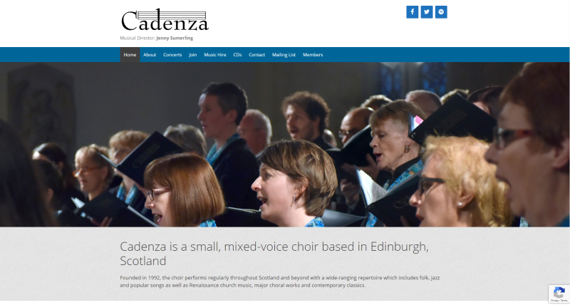
Cadenza is delighted to announce the launch of our new website. Coming almost 10 years to the day since the launch of our previous one, the new design offers significant benefits both to our audience and behind the scenes to our members too. We invite you to take a good look around and see what you think!

What’s New?
There are many highlights! Here’s just a few:
Concerts Page
There’s a new design to the concerts page, with a different way of displaying events. This allows us to provide a richer visual experience of each concert and event, bigger spaces to put posters etc and also provides a lot more information (map of venue, contact details).
Music Hire Page

We now will be publishing our library on the site and actively encouraging lending from our not-so-insignificant music assets. On the music hire page you can download a file that shows you what we have in our library, publisher, edition and number of copies, as well as details on the hire price. We hope this allows many other choirs to expand their concert repertoire by taking advantage of Cadenza’s varied back catalogue!
Reviews Page
A page that used to be hidden away, and was a little cluttered with all the kind reviews we received on one page, has been somewhat condensed into a new format on our Reviews page. And, to help make the appreciation we’ve had from audience and critics alike more visible, a random quote from a review will be shown at the bottom of each page.
If you’ve been to a Cadenza concert and have any comments to make, we’d love to hear from you.
Navigation Menu
The main menu has had a bit of work, to try and make sub-pages (like the Reviews page) easier to find. Similar attempts made to make the menu on mobile devices more usable, too. We hope you like them!
New ‘Responsive’ Design
This simply means the website should scale nicely to the screen size you are using. For example, if you’re looking at the site on a laptop or PC it should look different than when you view it on your mobile phone. This is intentional, and intended to ensure that the reader always has the most optimum experience. There’s more on the technical details of this below if you’re interested.

Members Area
There’s a new design to the members area. This is ‘behind the scenes’ for most visitors to the website, so we won’t go into detail here. However, if you’re really desperate to know what happens in this sacred part of the website, there is a simple solution: join us!
Why the update?
Put simply: our old website was showing it’s age, wasn’t the easiest to navigate and was not the most user-friendly to maintain. This is no reflection on the design itself – at the time it served it’s purpose flawlessly, and it was still doing its job right to the end. We will miss it. Feel free to say goodbye yourself if you’d like – the original site can be found at legacy.cadenza.org.uk for a while yet.
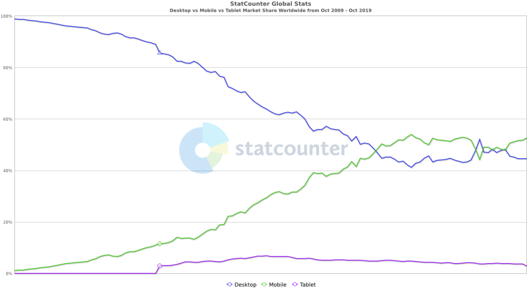
A lot has changed online in a decade – not least the devices on which we now consume websites. A decade ago, over 99% of all web traffic was as a result of people using desktop computers: as a result, most websites (including ours) was designed with only desktop computers in mind. Fast-forward a few years, and the most dominant source of web traffic today is mobile phones (52%), followed by desktops (45%) and then tablets (3%).

This posed a challenge to the old Cadenza website, which would typically not display nicely on small-screen devices (like mobile phones) without the user having to zoom in and out. It did not make for a nice user experience. However, this new site is responsive – which means it will adjust its layout to account for the size of the screen being used to display it. Someone visiting on a mobile phone in portrait orientation (taller than wide) will see the website one way, while someone visiting on a desktop computer with a widescreen monitor (wider than tall) will see the website in another way. Crucially, both people will get the best viewing experience for them.
